It's fascinating to be able to access quarter-billion-record GDELT Event Database - it is now available as a public dataset in Google BigQuery.
A couple of months ago, those data were published on BigQuery.
"World's largest event dataset now publicly available in BigQuery"
http://googlecloudplatform.blogspot.com/2014/05/worlds-largest-event-dataset-now-publicly-available-in-google-bigquery.html
"More than 250 million global events are now in the cloud for anyone to analyze"
http://gigaom.com/2014/05/29/more-than-250-million-global-events-are-now-in-the-cloud-for-anyone-to-analyze/
I am not an expert of BigQuery, but just testing the sample queries on the blog posts on BigQuery gives an idea of what we possibly can do.
Example query on the 250 million records detailing worldwide events from the last 30 years and discovered the top defining relationship for each year.
And this is the result you get. SUPER fast, and get interesting results.


Query result has 335 pages...


Of course you can download the data on csv, and do further analysis.
And using those data, people became able to use all those data and analyze easily using Google's computational power. Some examples:
Kalev Leetau visualized those data to show that Ukraine's protest was not just in Kiev.
It's Not Just Kiev - Using Big Data to map Ukraine's protest violence.
http://www.foreignpolicy.com/articles/2014/02/21/it_s_not_just_kiev_ukraine_protest_map

New Scientist's visualization of civilian violence Syrian Civil War.
http://syria.newscientistapps.com/

"Correlating the Patterns of World History With BigQuery"
http://googlecloudplatform.blogspot.com/2014/08/correlating-patterns-of-world-history-with-bigquery.html
The query on this post made me feel....

According to the author and my friend +Felipe Hoffa, "this query has 2 subqueries: The smaller one finds the timeline of 30 days in Egypt before 2011-01-27, while the left side collects all sets of 30 days events for every country through GDELT's ever-growing dataset. With a cross join between the first set and all the sets on the left side, BigQuery is capable of sifting through this over a million combinations computed in real-time and calculate the Pearson correlation of each timeline pair. For a visual explanation, see the linked IPython notebook."
What it gives you is a list of all the worldwide periods from the last 35 years, as monitored by GDELT, that have been most similar to Egypt’s two months preceding the core of its revolution.
You get this result with 23,640 pages, so better to download the data and analyze separately :)
But first looking at the first page result: the two most highly correlated periods are Germany 7/8/2009 – 9/6/2009 (r=0.827) and Sweden 10/4/2010 – 12/3/2010 (r=0.824).

You can read the analysis result by Kalev Leetau in this blog post:
"Towards Psychohistory: Uncovering the Patterns of World History with Google BigQuery"
http://blog.gdeltproject.org/towards-psychohistory-uncovering-the-patterns-of-world-history-with-google-bigquery/
Upper chart (Germany & Sweden in green, Egypt in red), with the X axis being the number of days from the start of the period (thus position 0 corresponds with 11/28/2010 for Egypt, 7/8/2009 for Germany, and 10/4/2010 for Sweden). To make it easier to compare each pair of countries, raw volume counts are replaced with “Z scores” (standard deviations from the mean).
 Figure 1 – Germany 7/8/2009 – 9/6/2009 (green left of black line) and 9/6/2009 – 11/5/2009 (green right of black line) compared with Egypt (red)
 Figure 2 – Sweden 10/4/2010 – 12/3/2010 (green left of black line) and 12/3/2010 – 2/1/2011 (green right of black line) compared with Egypt (red)
He further analyzes data from the 60 days preceding the ouster of former Ukrainian president Viktor Yanukovych and the 60 days after that, and 120-day period from 1999 in Turkey, or another query with post-peak events in Turkey and 120 days from 2007 in Libya.
Kalev's takeaways:
"This analysis of modern history is a prime example of why big data really matters"
http://gigaom.com/2014/08/13/this-analysis-of-modern-history-is-a-prime-example-of-why-big-data-really-matters/
The author of this post, Derrick Harris concludes:
There are more analysis on people data of GDELT by Kalev (not sure if he used BigQuery for this one), which he put together on this article:
The Tehran Connection
http://kalevleetaru.com/dataanddiplomacy/network-iran15.html


"Who is mentioned in the news in reference to Nigeria and corruption?"
http://zoom.it/9BVp

I don't have any knowledge to comment on this one... any Nigerian people able to comment??

Update 2/22/2015
Looks like GDELT 2.0 will have 15 minute updates, realtime translation of 65 languages, etc. Read more on their blog post below:
GDELT 2.0: Our Global World in Realtime
GDELT Translingual: Translating the Planet
Disclaimer: The opinions expressed here are my own, and do not reflect those of my employer. -Fumi Yamazaki
A couple of months ago, those data were published on BigQuery.
"World's largest event dataset now publicly available in BigQuery"
http://googlecloudplatform.blogspot.com/2014/05/worlds-largest-event-dataset-now-publicly-available-in-google-bigquery.html
"More than 250 million global events are now in the cloud for anyone to analyze"
http://gigaom.com/2014/05/29/more-than-250-million-global-events-are-now-in-the-cloud-for-anyone-to-analyze/
I am not an expert of BigQuery, but just testing the sample queries on the blog posts on BigQuery gives an idea of what we possibly can do.
Example query on the 250 million records detailing worldwide events from the last 30 years and discovered the top defining relationship for each year.
SELECT Year, Actor1Name, Actor2Name, Count FROM (
SELECT Actor1Name, Actor2Name, Year, COUNT(*) Count, RANK() OVER(PARTITION BY YEAR ORDER BY Count DESC) rank
FROM
(SELECT Actor1Name, Actor2Name,  Year FROM [gdelt-bq:full.events] WHERE Actor1Name < Actor2Name and Actor1CountryCode != '' and Actor2CountryCode != '' and Actor1CountryCode!=Actor2CountryCode),  (SELECT Actor2Name Actor1Name, Actor1Name Actor2Name, Year FROM [gdelt-bq:full.events] WHERE Actor1Name > Actor2Name  and Actor1CountryCode != '' and Actor2CountryCode != '' and Actor1CountryCode!=Actor2CountryCode),
WHERE Actor1Name IS NOT null
AND Actor2Name IS NOT null
GROUP EACH BY 1, 2, 3
HAVING Count > 100
)
WHERE rank=1
ORDER BY Year
Next sample query is this one, compiling every protest in Ukraine that GDELT found in the world’s news media, by month, from 1979 to present. Since there is a lot more news media in 2014 than in 1979, the raw count of protests per month is normalized.
SELECT MonthYear MonthYear, INTEGER(norm*100000)/1000 Percent
FROM (
SELECT ActionGeo_CountryCode, EventRootCode, MonthYear, COUNT(1) AS c, RATIO_TO_REPORT(c) OVER(PARTITION BY MonthYear ORDER BY c DESC) norm FROM [gdelt-bq:full.events]
GROUP BY ActionGeo_CountryCode, EventRootCode, MonthYear
)
WHERE ActionGeo_CountryCode='UP' and EventRootCode='14'
ORDER BY ActionGeo_CountryCode, EventRootCode, MonthYear;
Query result has 335 pages...
... so I'll just click chart view. You can see there were protests series of protests in 1989 (“Revolutions of 1989”) another peak in October 1995 (not sure what that was), another in March 2001(“Ukraine without Kuchma protest”), big spike in November 2004 (“Orange Revolution”) and the recent 2014 protests.
Of course you can download the data on csv, and do further analysis.
And using those data, people became able to use all those data and analyze easily using Google's computational power. Some examples:
Kalev Leetau visualized those data to show that Ukraine's protest was not just in Kiev.
It's Not Just Kiev - Using Big Data to map Ukraine's protest violence.
http://www.foreignpolicy.com/articles/2014/02/21/it_s_not_just_kiev_ukraine_protest_map
New Scientist's visualization of civilian violence Syrian Civil War.
http://syria.newscientistapps.com/
"Correlating the Patterns of World History With BigQuery"
http://googlecloudplatform.blogspot.com/2014/08/correlating-patterns-of-world-history-with-bigquery.html
The query on this post made me feel....
According to the author and my friend +Felipe Hoffa, "this query has 2 subqueries: The smaller one finds the timeline of 30 days in Egypt before 2011-01-27, while the left side collects all sets of 30 days events for every country through GDELT's ever-growing dataset. With a cross join between the first set and all the sets on the left side, BigQuery is capable of sifting through this over a million combinations computed in real-time and calculate the Pearson correlation of each timeline pair. For a visual explanation, see the linked IPython notebook."
SELECT
  STRFTIME_UTC_USEC(a.ending_at, "%Y-%m-%d") ending_at1,
  STRFTIME_UTC_USEC(b.ending_at-60*86400000000, "%Y-%m-%d") starting_at2,
  STRFTIME_UTC_USEC(b.ending_at, "%Y-%m-%d") ending_at2,
  a.country, b.country, CORR(a.c, b.c) corr, COUNT(*) c
FROM (
  SELECT country, date+i*86400000000 ending_at, c, i
  FROM [gdelt-bq:sample_views.country_date_matconf_numarts] a
  CROSS JOIN (SELECT i FROM [fh-bigquery:public_dump.numbers_255] WHERE i < 60) b
) b
JOIN (
  SELECT country, date+i*86400000000 ending_at, c, i
  FROM [gdelt-bq:sample_views.country_date_matconf_numarts] a
  CROSS JOIN (SELECT i FROM [fh-bigquery:public_dump.numbers_255] WHERE i < 60) b
  WHERE country='Egypt'
  AND date+i*86400000000 = PARSE_UTC_USEC('2011-01-27')
) a
ON a.i=b.i
WHERE a.ending_at != b.ending_at
GROUP EACH BY ending_at1, ending_at2, starting_at2, a.country, b.country
HAVING (c = 60 AND ABS(corr) > 0.254)
ORDER BY corr DESC
What it gives you is a list of all the worldwide periods from the last 35 years, as monitored by GDELT, that have been most similar to Egypt’s two months preceding the core of its revolution.
You get this result with 23,640 pages, so better to download the data and analyze separately :)
But first looking at the first page result: the two most highly correlated periods are Germany 7/8/2009 – 9/6/2009 (r=0.827) and Sweden 10/4/2010 – 12/3/2010 (r=0.824).
You can read the analysis result by Kalev Leetau in this blog post:
"Towards Psychohistory: Uncovering the Patterns of World History with Google BigQuery"
http://blog.gdeltproject.org/towards-psychohistory-uncovering-the-patterns-of-world-history-with-google-bigquery/
Upper chart (Germany & Sweden in green, Egypt in red), with the X axis being the number of days from the start of the period (thus position 0 corresponds with 11/28/2010 for Egypt, 7/8/2009 for Germany, and 10/4/2010 for Sweden). To make it easier to compare each pair of countries, raw volume counts are replaced with “Z scores” (standard deviations from the mean).
He further analyzes data from the 60 days preceding the ouster of former Ukrainian president Viktor Yanukovych and the 60 days after that, and 120-day period from 1999 in Turkey, or another query with post-peak events in Turkey and 120 days from 2007 in Libya.
Kalev's takeaways:
"While it is unlikely that one would build a true political risk forecasting system on an approach this simple, it does suggest that world history, at least the view of it we see through the news media, is highly cyclic and predictable, and that there is much yet to be discovered. Will these patterns hold for every country and time period and is there a certain rolling window size that works better or worse? Does a different time interval or switching to a different set of event types improve or degrade accuracy? Does it work better just before a conflict or only in its first few days? Let your creativity run wild and let us know what you find!"Gigaom wrote a blog post based on Kalev's analysis:
"This analysis of modern history is a prime example of why big data really matters"
http://gigaom.com/2014/08/13/this-analysis-of-modern-history-is-a-prime-example-of-why-big-data-really-matters/
The author of this post, Derrick Harris concludes:
"The real value of cloud computing is in putting all this data in a centralized place with centralized computing resources so researchers aren’t on the hook for somehow downloading it, storing it and having enough computers to analyze it. It might be there’s nothing of value to be gleaned from Leetaru’s analysis of modern history, or might be there’s a nugget of immense value buried a few layers below the surface. But if we really want to find answers to tough problems, we owe it to ourselves to examine every signal. Done right, big data provides a lot of them."===========================================================
There are more analysis on people data of GDELT by Kalev (not sure if he used BigQuery for this one), which he put together on this article:
The Tehran Connection
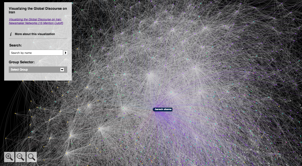
"Iran's nuclear program has been one of the hottest topics in foreign policy for years, and attention has only intensified over the past few days, as an interim agreement was reached in Geneva to limit enrichment activity in pursuit of a more comprehensive deal. The details of the deal itself are of course interesting, but in aggregate the news stories about Iran can tell us far more than we can learn simply by reading each story on its own. By using big data analytics of the world's media coverage, combined with network visualization techniques, we can study the web of relationships around any given storyline -- whether it focuses on an individual, a topic, or even an entire country. Using these powerful techniques, we can move beyond specifics to patterns -- and the patterns tell us that our understanding of Iran is both sharp and sharply limited."You can see actual visualization on the website here:
http://kalevleetaru.com/dataanddiplomacy/network-iran15.html
"In the diagram below, every global English-language news article monitored by the GDELT Global Knowledge Graph -- a massive compilation of the world's people, organizations, locations, themes, emotions, and events -- has been analyzed to identify all people mentioned in articles referencing any location in Iran between April and October 2013. A list was compiled of every person mentioned in each article, and all names mentioned in an article together were connected. The end result was a network diagram of all of the people mentioned in the global news coverage of Iran over the last seven months and who has appeared with whom in that coverage.
This network diagram was then visualized using a technique that groups individuals who are more closely connected with each other, placing them physically more proximate in the diagram, while placing individuals with fewer connections farther apart. Then, using an approach known as community finding, clusters of people who are more closely connected with each other than with the rest of the network were drawn in the same color. The specific color assigned to each group is not meaningful, only that people drawn in the same color are more closely connected to one another. Together, these two approaches make the overall macro-level structure of the network instantly clear, teasing apart the clusters and connections among the newsmakers defining Iranian news coverage."
"Because most names in the news occur in just a handful of articles, the visual above shows the result of filtering the network to show only those names that occurred in 15 or more articles. This eliminates the vast majority of names, while preserving names that are more likely to be directly related to Iranian affairs and still capturing a broad swath of the discourse around Iran. The purple cluster is largely the United States and its allies, with Barack Obama right in the center, while the dark blue node towards of the lower center of the entire network is Edward Snowden, capturing the way in which he has become one of the most prominent figures in discussion of U.S. foreign policy. This is a fascinating finding: While Snowden obviously has no part in the Iranian-U.S. nuclear talks, his outsized role in the global conversation about U.S. foreign policy has made him part of the context in which those talks are discussed. In particular, there has been substantial media coverage connecting the approaches Snowden used to defeat the NSA's internal security procedures with some of those used by the United States in its attempts to sabotage Iran's nuclear efforts. The media has also used the materials Snowden has released to reconstruct how U.S. spy agencies may have been involved in the Stuxnet attack on Iran."
"The blue-green cluster in the bottom right largely consists of Israeli reporters and commentators, while the light blue cluster at top left consists of international reporters. The yellow cluster along the left side of the graph is where all of the Iranian names appear, with key figures like Hassan Rouhani, Ali Khamenei, Mohammad Javad Zarif, and Mahmoud Ahmadinejad all playing prominent roles in bridging Iran to the other clusters. Iranian politicians like Esfandiar Rahim Mashaei, Mohammad-Reza Aref, and Gholam Ali Haddad-Adel play central roles internally to the cluster, representing their important roles within Iran, but their limited engagement and contextualization over the last several months with the rest of the world.
The fact that this network accurately distinguishes internal and external leaders is a critical finding. Such resolving power means that this approach of externally mapping the newsmaker network around a country using public news coverage is sufficiently accurate to capture the nuance between newsmakers who operate largely within a country and those who have a more external role, and the external newsmakers with whom they are most closely connected. That such a news-based network would be capable of perceiving such nuanced detail suggests this approach may have powerful applications for mapping the internal structure of countries and organizations that receive considerable media coverage, but for which policymakers lack the detailed leadership diagrams compiled for higher-profile subjects like Iran.
The visual also makes it clear that the discourse around Iran does not focus on Iran itself or its internal politics, but rather on its nuclear ambitions and how they fits into the rest of the world. In particular, there is a strong Western-centric narrative to the English-language coverage around Iran, emphasizing U.S. interests, with Iranian leaders mentioned only in passing as they relate to those interests. In other words, news coverage across the world focuses on what the United States wants from Iran and what Iran needs to do to satisfy those demands, rather than the Iranian perspective on its role in the world. This is a key finding, as it reflects Iran's intense marginalization over its nuclear program and is in contrast to other nations like Egypt."Another visualization of people with the theme:
"Who is mentioned in the news in reference to Nigeria and corruption?"
http://zoom.it/9BVp
I don't have any knowledge to comment on this one... any Nigerian people able to comment??
Update 2/22/2015
Looks like GDELT 2.0 will have 15 minute updates, realtime translation of 65 languages, etc. Read more on their blog post below:
GDELT 2.0: Our Global World in Realtime
GDELT Translingual: Translating the Planet
Disclaimer: The opinions expressed here are my own, and do not reflect those of my employer. -Fumi Yamazaki