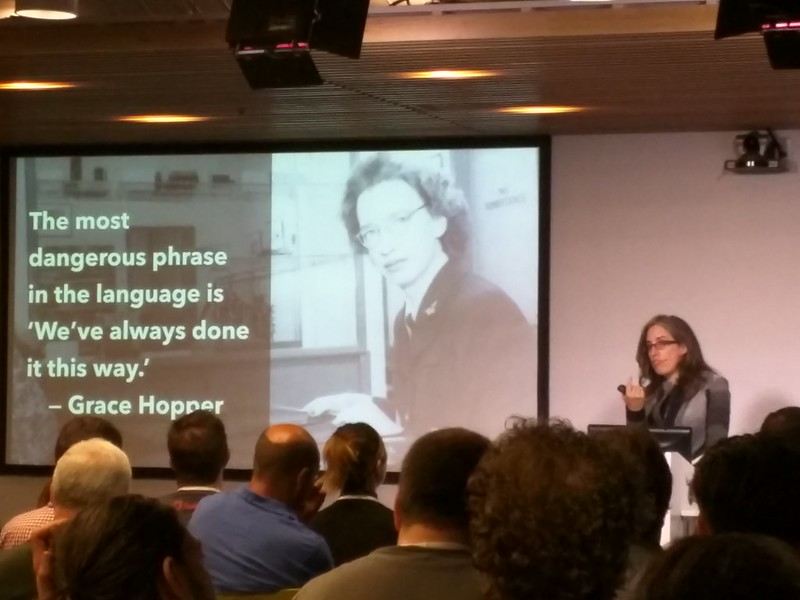
I joined SFHTML5 meetup last week, the speaker was +Jen Simmons and she gave a speech under the title "Modern Layouts: Getting Out of Our Ruts".

In case you missed it, worth your 70 min to watch!
Slides:
Demos:
http://labs.thewebahead.net/thelayoutsahead/
Code:
https://github.com/jensimmons/thelayoutsahead
Jen's Website:
http://thewebahead.net/
Video:
Some notes from the talk:
The people in the web industry were the people who'd be saying "The web is not print! We need to do it differently! Web is not print!"
True- but it is now time to look at magazines and print to learn about their wonderful and beautiful and creative layouts. Because, a lot of websites look the same. Many of them look ugly. They're full of ads. We need to learn from the beautiful magazines to make more beautiful websites. And current web technology actually allows us to do that.
Vogue magazine :D
vogue.com website :(
Magazines :D
Websites :(
This is a screenshot from a magazine article.
"You can totally make this happen on the web, using CSS Shapes level1" says Jen.
And here are some examples of how to make creative layout using CSS Shapes.
You can get the words between the images too, using masked images.
And here you can write a code to surround the text outside of polygon.
And then you can use the CSS Shapes editor Chrome plugin, to adjust and define a polygon shape. Super cool!!
Some more examples from magazines.
We can also definitely do similar things on the web by transforming text using CSS Transforms Module. Many people thinks about transforming (rotating) for animations- we should use it for other purposes -not just animations.
Some more styles that we might see more in the future: no matter what shape the window is, the height is always 100vh(viewport hight), and the there's the black box surrounding it, followed by the text.
An example of similar approach that was on New York Times article:
Judy Blume Knows All Your Secrets - NYTimes.com
But they seem to be using JavaScript for layout, when they don't have to...
"We don't need more JavaScript on our pages- we already have JavaScripts for ads, tracking users and analytics and all kinds of things, we already have performance problems on the web. I am a big believer that the moment you reach for JavaScript to solve a layout problem, you're doing it wrong. There should be a ban on using JavaScript for layout. You can do everything with CSS. It's going to be much faster, much more performative." says Jen.
On Flexbox: "There's lots of things that Flexbox can do, I think it'll take several years to know what Flexbox is capable of. I think the people who invented Flexbox don't even know what Flexbox is capable of - it's really that crazy awesome!"
A lot of people asks when they can use those features in production. Jen replies with a question: Do websites need to look exactly the same in every browser?
http://dowebsitesneedtolookexactlythesameineverybrowser.com/
"If you went to this site with IE6, it doesn't have drop shadow on the text, "N" won't be curly, but if you're actually a person using IE6- you wouldn't know that you are missing a drop shadow. People will only know about their own browser, and will not cry over the missing drop shadow that they don't know that exists. And this is the fundamental concept of Progressive Enhancement, and what the web is about." says Jen.
"Your website can look different in different browser, we don't need to hold the entire web hostage until IE7 doesn't exist any more, and make everyone on the web get the IE7-looking websites because we're scared to have the website look different on different browser."
"Hardest part is changing our thinking, not our CSS."
"Translate. Don't Transfer."
Looking at some magazines- good layout really serves the content and alters people's experience of that content. "It's important to remember the lessons we learned in the era when everyone thought the web was print and went the wrong road. We don't want to just transfer from graphic design, magazine design into the web- we have to translate. We have to get some inspiration, and come up with something we have never seen before that goes on to the web."
Experiment! Prototype!
The most dangerous phrase in the language is "We've always done it this way"
-Grace Hopper
And if you're interested in watching Bill Cunningham's "New York" that Jen mentioned, you can watch it on Hulu!
Storify:
Disclaimer: The opinions expressed here are my own, and do not reflect those of my employer.
-Fumi Yamazaki


0 件のコメント:
コメントを投稿